Designed by Ashley S.
Available to hire ⏺


Designer: Ashley S.
Designer: Barış Ş.
Designer: Tim B.
Designed by Tim B.
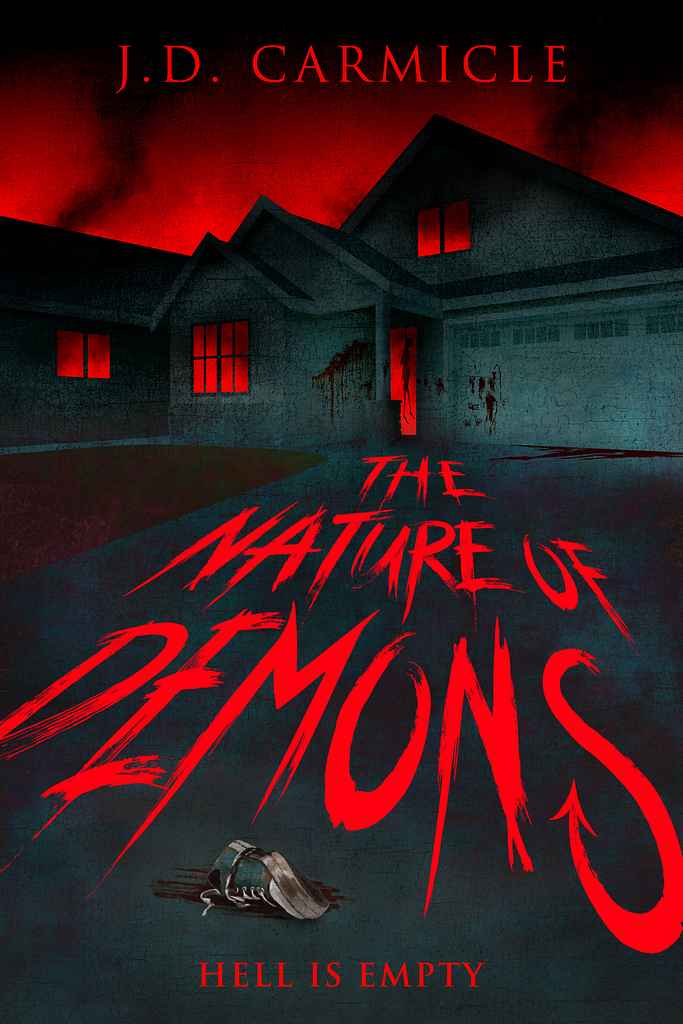
Available to hire ⏺"The Nature of Demons describes an ordinary world that has suddenly gone to pieces due to a supernatural apocalypse. I wanted to depict how an ordinary street in suburbia might look a couple of days after the event, and for it to have a similar feel to some of the medieval paintings of hell by Bruegel and Bosch."
Designer: Marta D.
Designed by Marta D.
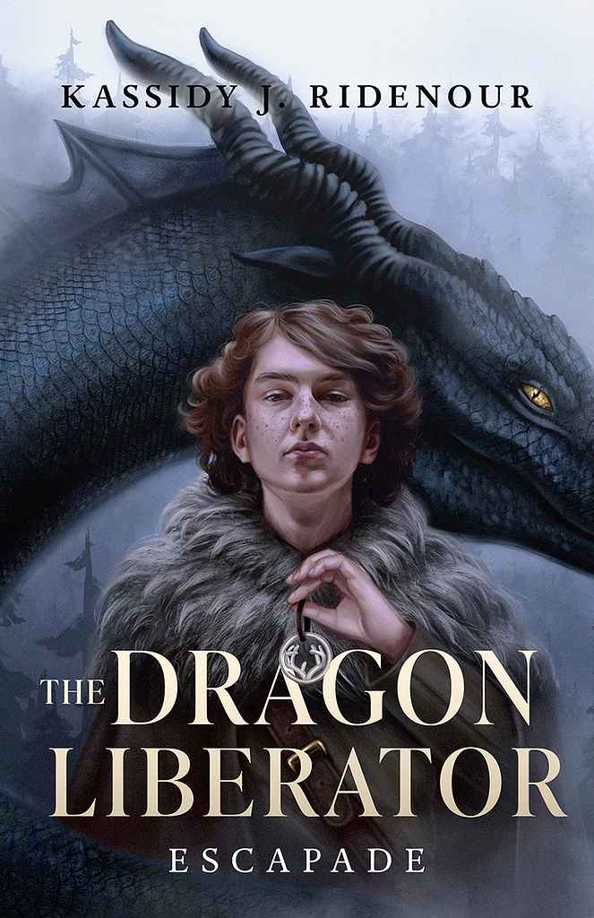
Available to hire ⏺"The cover showcases the main character of the novel, Fendrel, and his dragon, hinting at the plot with eye-catching details, such as Fendrel’s pendant. The goal was to create a semi-realistic illustration reminiscent of classic epic fantasy covers, while making it appealing to a younger audience."
Designer: My Lan K.
Designer: Nejc P.
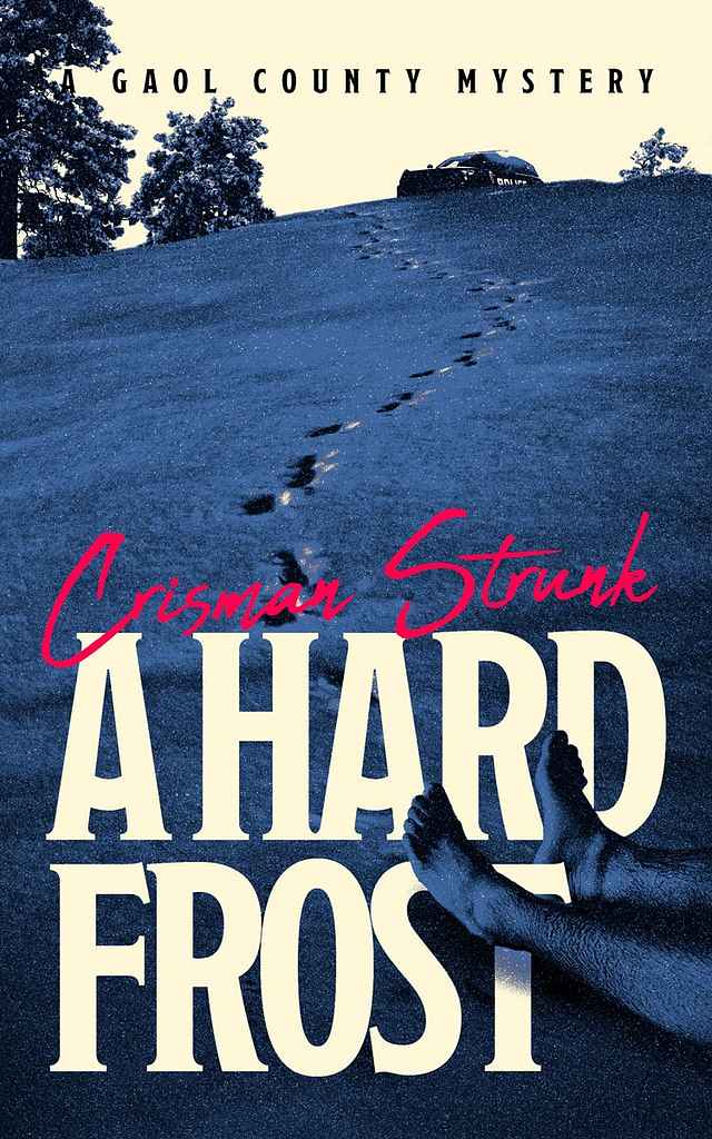
Designed by Nejc P.
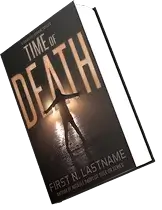
Available to hire ⏺"When we began developing the cover, Crisman Strunk already had a strong idea in mind: a frost-covered Appalachian field with a body in the distance. With that direction established, my goal was to transform the concept into a strong, commercially effective cover that immediately establishes genre and tone. I used strong perspective to create depth, negative space to build tension, and a limited color palette to keep the mood focused and cohesive."
Designer: Andy M.
Designer: Owen G.
Designer: Caitlin B. A.
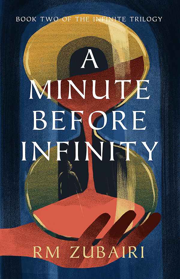
Designed by Caitlin B. A.
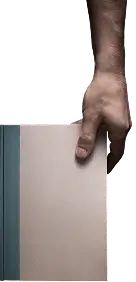
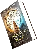
Available to hire ⏺"As the second book in the series, this cover reflects the growth and development of details within the story. It showcases a more complicated and metaphorical design while referencing our first cover's use of the hand and mysterious color palette. Here, we wanted to represent the series' infinite theme with an hourglass and its immersive writing style by adding a faint figure within it."
Designer: Vanessa M.
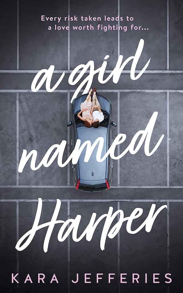
Designed by Vanessa M.
Available to hire ⏺"This cover reflects a guarded love story and a fresh start. The single, quiet moment hints at two people drawn together while still holding their own space, much like the characters themselves. The clean layout and handwritten title keep it modern and warm, suggesting vulnerability, second chances, and a romance that builds naturally rather than all at once."
Designer: Barış Ş.
Designer: Nejc P.
Designed by Nejc P.
Available to hire ⏺"For this cover, the goal was to merge two visual worlds: the nostalgic charm of classic Hardy Boys covers and the symbolic structure of a traditional tarot card. Florida pines frame the scene, tarot iconography anchors the layout, and key paranormal creatures appear as archetypes. The result reinforces the novel’s central tension while inviting readers to open the book and solve the mystery themselves."
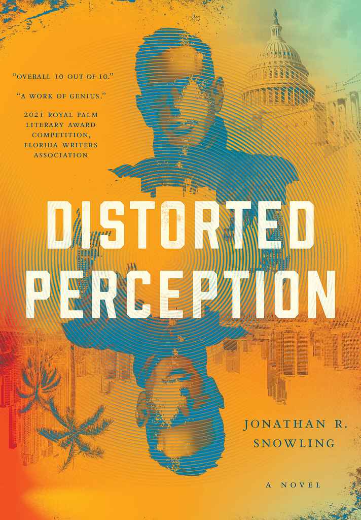
Designer: Paul P.
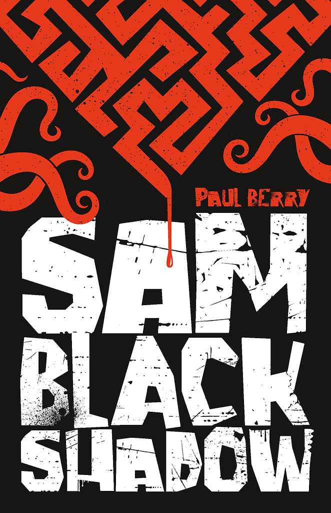
Designed by Paul P.
Available to hire ⏺"I have fond memories of the Herbert Van Thal (yes, that was his real name) 'Horror Stories' anthologies from the 60s. I loved the 'horror' font and the scary imagery that stood out from a bookshelf, and I was hoping that with the design for Paul Berry's Sam Black Shadow, I could achieve something equally impactful."
Designer: Richard L.
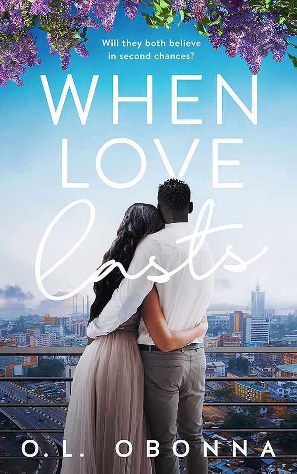
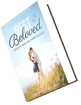
Designer: Vanessa M.
Designed by Vanessa M.
Available to hire ⏺"This cover leans into the emotion of a love that once felt certain and now feels fragile. The couple turned away from us captures distance, memory, and unresolved feelings, while the city backdrop grounds the story in real life rather than fantasy. The soft colours and flowing title keep it romantic, but slightly wistful, reflecting a marriage tested by betrayal, the pull of the past, and the possibility of a second chance."
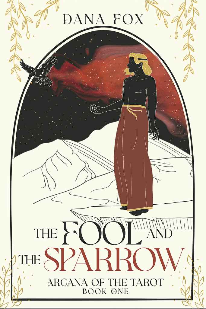
Designer: Natalia J.
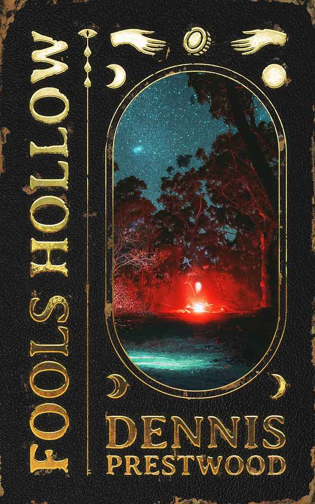
Designed by Natalia J.
Available to hire ⏺"The cover reimagines The Fool tarot card composition through a contemporary lens. Framed like a tarot card, the design contrasts a light background with a red nebula cutting through the night sky, hinting at danger and the romance in the story. The male figure and sparrow reflect the story’s duality, blending mysticism and intrigue into the composition."
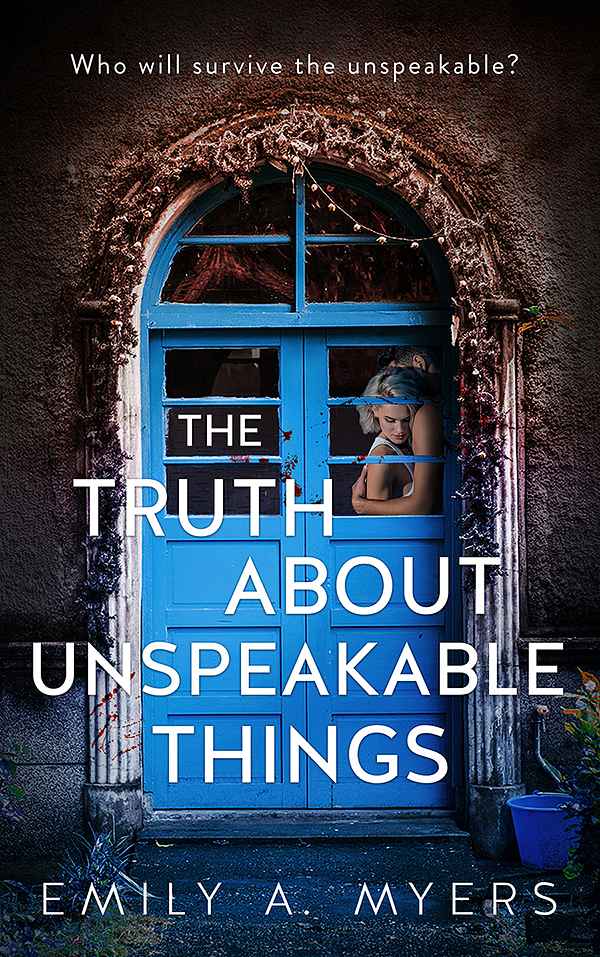
Designer: Vanessa M.
Designed by Vanessa M.
Available to hire ⏺"This cover leans into secrecy and danger. The closed blue door suggests things hidden, things locked away, while the glimpse inside hints at intimacy, vulnerability, and risk. It mirrors Emma’s story of trying to rebuild after violence, caught between wanting safety and being pulled back into something dark. The contrast between beauty and threat reflects a journey where love, fear, and survival exist side by side, and where the truth comes at a cost."
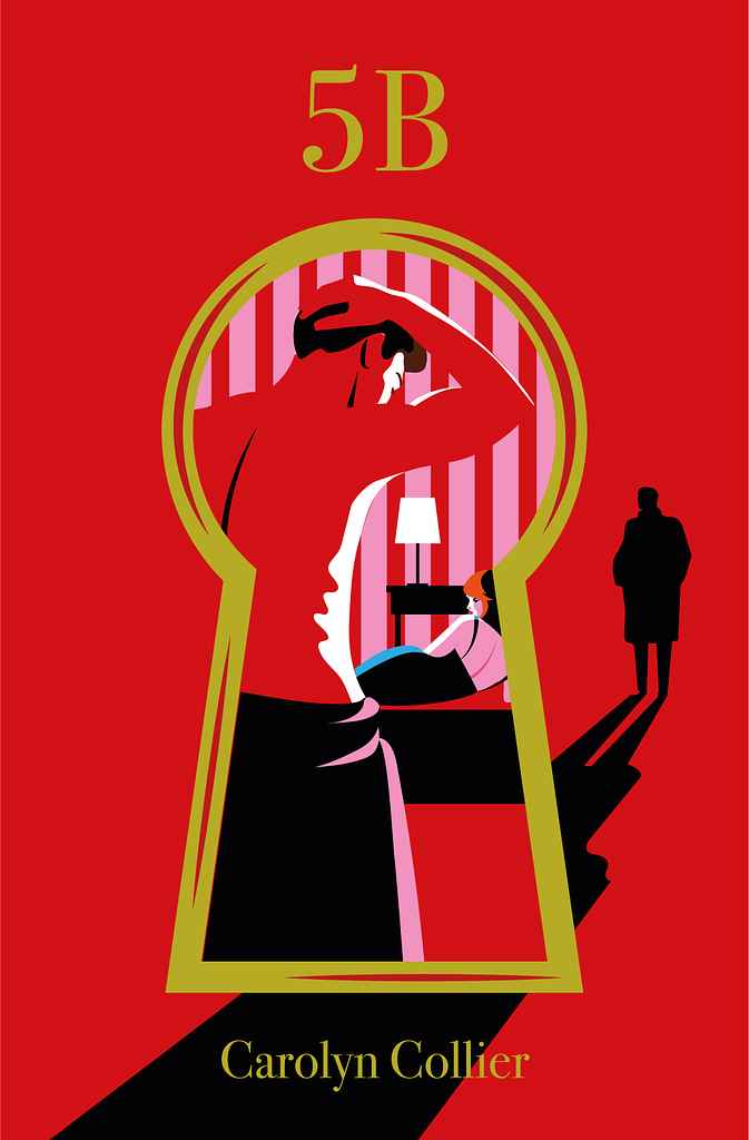
Designer: Margarita C.

Your fictional world is as important to us as it is you. Trust us in bringing your layered characters sharp dialogue, strong plots, and vivid storytelling to life.
We take what you know, your personal stories, or thoughts - then shape them into a compelling story that grabs attention, sparks ideas, and lights up curiosity.
We turn your real-life experiences into a heartfelt, honest story. Staying true to your voice, we shape moments, lessons, and emotions into a memoir that feels genuine, reflective, and deeply relatable.
We create cozy tales kids enjoy - simple words, playful heroes, plus ideas that stick, turning each page into a joyful moment they won’t forget - all made just right for little minds.
We craft your life narrative with sincerity, feeling, and transparency, seizing the instances that influenced you and transforming them into a significant, compelling tale that readers genuinely engage with.
We craft vibrant worlds - bold magic rules, gripping journeys that draw you in. Mix wild ideas with tight plots, so the story breathes on its own. This isn’t just fantasy - it sticks with you, moment by moment.
We build sincere love tales filled with real emotion - characters you recognize, sparks that matter, tension that sticks around. The vibe? Cozy, alive, hard to walk away from once you dive in.


To make your book shine, we combine industry knowledge with skilled storytelling. Each chapter is designed to enthrall readers and strengthen your reputation as a writer